
Quality
guarantee
Environmental
protection
Novel
design
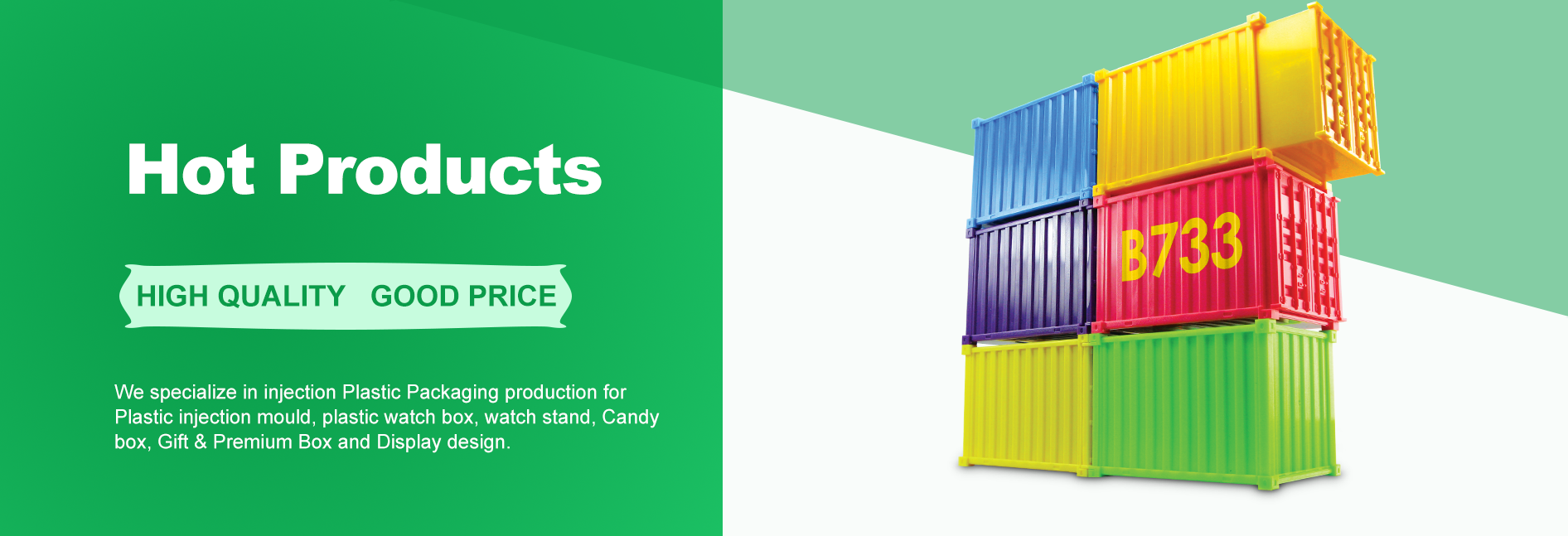
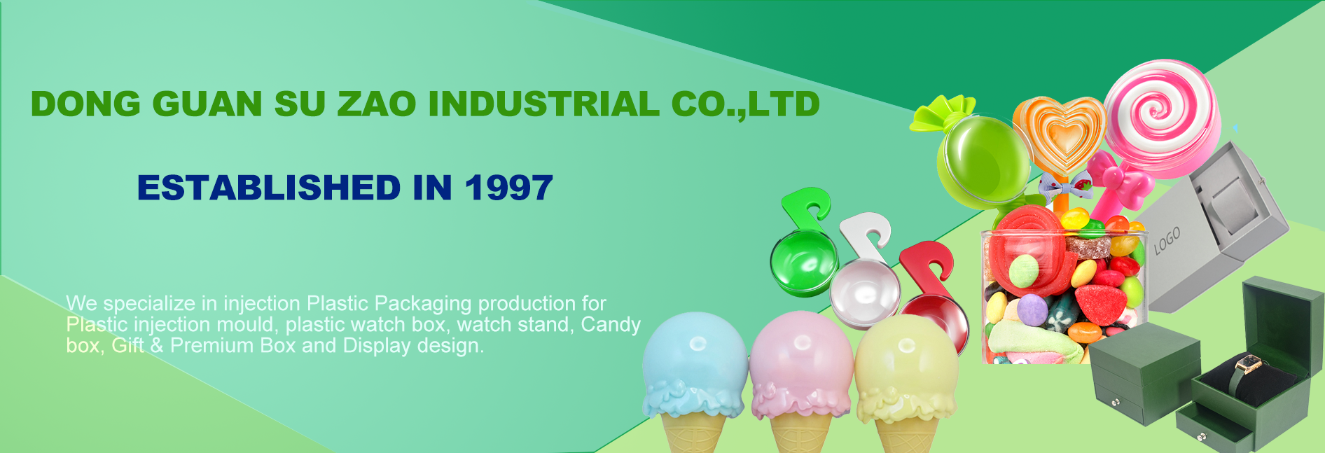
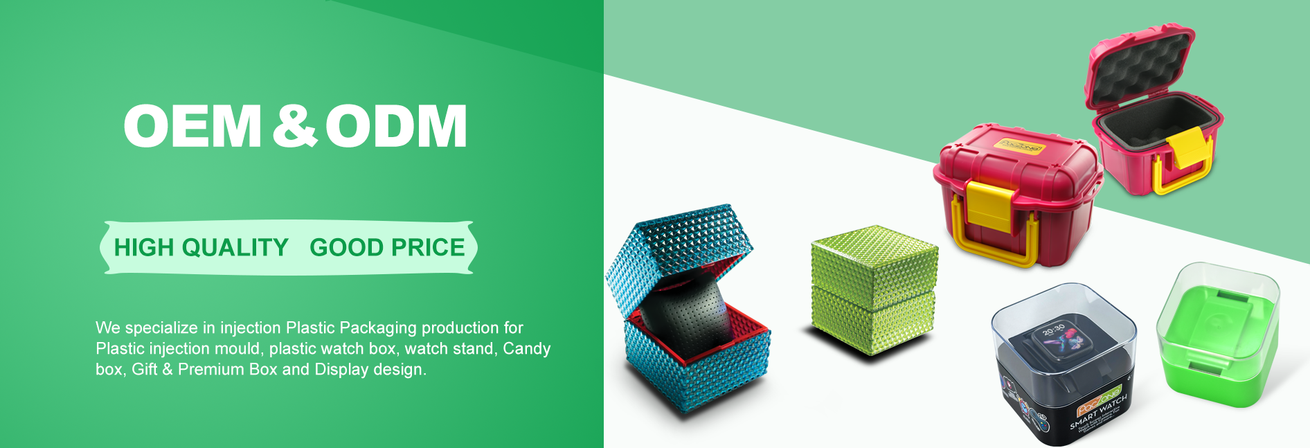
Professional watch / gift / candy boxes manufacturer


The human visual system is far more sensitive to color than to other sensory stimuli. Consumers in front of a candy display form their first impression of a product’s packaging in just 0.3 seconds, with color accounting for 62% of that initial judgment. Neuroscience research shows that vibrant color combinations trigger dopamine release, creating a sense of pleasure—a physiological response that translates directly into a positive attitude toward the product. A classic example is M&M’s "Rainbow" strategy: by mixing differently colored chocolate candies in one pack, they created a visual "color feast," leading to a 27% sales increase after introducing the multicolored packaging. Color doesn’t just convey information; it evokes emotion, an advantage monochromatic packaging struggles to match.
Different color combinations can precisely target specific consumer groups. High-saturation primary colors (like those used in Skittles’ rainbow packaging) appeal to children, who have an innate preference for bright hues—studies show such packaging increases children’s product requests by nearly 3x. Meanwhile, brands targeting adults often opt for low-brightness, complex tones, such as Godiva’s deep brown and gold packaging, which conveys sophistication and luxury. KitKat’s regional editions in Japan exemplify color-based localization: matcha-flavored bars in soft green, strawberry in pink—each shade reinforcing regional identity and turning the candy into a must-buy souvenir. This "color positioning" strategy helped KitKat achieve double-digit sales growth in Japan for five consecutive years.
In the brutal competition for shelf space, color becomes a brand’s secret weapon. Data shows that shoppers spend an average of just 12 seconds in the candy aisle—during which time products with high color contrast are 6x more likely to be noticed. Jelly Belly’s "kaleidoscope" packaging creates a striking visual impact, increasing its "eye share" by 34% compared to competitors. This "visual salience" directly translates into sales: products with bold, contrasting colors see 40% higher first-time purchase rates than their plainer counterparts. When competitors rely on single or dual-tone packaging, a well-designed multicolor box acts like a silent scream, grabbing attention in the split second a consumer scans the shelf.
There’s a fascinating cross-sensory link between color and taste, a phenomenon widely exploited in food packaging. Psychological experiments confirm that 73% of people expect lemon flavor from yellow packaging, while red automatically signals strawberry. Haribo gummies use precise color coding—green for apple, orange for citrus—creating an intuitive flavor-identification system that eliminates the need for text. This "color-taste" consistency not only enhances the consumer experience but also reduces decision fatigue. Studies show proper color coding increases taste satisfaction by 28% and repeat purchases by 19%. When packaging colors closely match actual flavors, a "taste enhancement effect" occurs, with consumers perceiving the candy as 15% sweeter.
Applying color psychology to candy packaging is a precise science. Warm tones (red, orange, yellow) stimulate appetite, which is why 85% of candy brands use them in logos or packaging. Cool tones (blue, green) suggest freshness or tartness, while brightness and saturation send their own signals: light hues imply "low sugar" or "mild," whereas vibrant shades emphasize "bold fruitiness." Swiss brand Ricola discovered that shifting their packaging from dark green to bright yellow-green boosted consumer perception of its "natural herbal" quality by 22%—a minor tweak with major impact. Seasonal color strategies are equally powerful: Christmas-themed red and green packaging can spike sales by 300% during the holidays.
In the candy industry, multicolor packaging has become indispensable for brand identity. M&M’s "Color Personalities" campaign gave each shade a unique character—red for bold, yellow for goofy, blue for cool—turning the candies into social media stars with 1.8 billion engagements. Colors don’t just differentiate flavors; they build brand equity. When consumers instantly recognize a brand by its color scheme, that "color asset" becomes a visual shorthand for the product. Brands with strong color systems enjoy 47% higher ad recall than industry averages. Limited-edition colors, like Milka’s "Violet Edition," not only drive short-term sales but also gather valuable data on color preferences for future product development.
From neuroscience to consumer psychology, overwhelming evidence confirms that multicolored candy boxes significantly boost sales. However, an effective color strategy isn’t about "more is better"—it’s a nuanced blend of consumer insight, product essence, and market dynamics. When color science meets creative design, a humble candy box transcends its basic function, becoming a psychological lever that moves consumers to act. In this visually driven era, candy brands that ignore the power of color risk surrendering market share to rivals who master the art of chromatic persuasion. After all, in the sweet battlefield of confectionery, the product that catches the eye first is usually the one that ends up in the mouth first.

Phone:+86 136 5269 1365
Email:[email protected]
Address:No.18 Fuxing Road, Xiagang Community, Chang'an Town, Donguan City, Guangdong Province